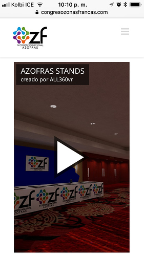
embedded windows can’t adjust to the size of the mobile device screens (a client needs to be resized automatically) Do you have a script that adjust the embed wundow automatically for that’s screen?
Do you mean you want the size of the visualization iframe to adjust to the viewport size? You could then try to use vw (viewport width) and vh (viewport height) units of the CSS. For example, if you used the following embed code:
<iframe style="width: 80vw; height: 80vh; border: none;"
        allowfullscreen allow="gyroscope; accelerometer; xr-spatial-tracking; vr;" scrolling="no"
        src="https://your-user-name.shapespark.com/your-scene-name/">
</iframe>
the size of the iframe would be 80% of the viewport width x 80% of the viewport height, and would be reponsive to viewport size changes.
1 Like
Thanks @wojtek I will try and share the results
Success! Thanks @wojtek, your last scrip works great. This is the mobile page where our scene is embedded.
1 Like
