Dear,
I have added one image and one iframe (Youtube) in HTML extensive viewer.
It looks as with the same width at PC/Tablet but not in mobile devices.(The width is 650px)
I have tried many things with CSS, however I can’t find the solution.
If anyone could help me with this problem or share experience, that would be highly appreciated.
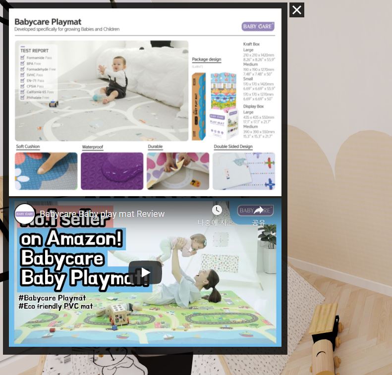
PC
Mobile
wojtek
2
Could you share a link to this scene, so we could take a look at the HTML/CSS for this HTML label?
wojtek
4
Try limit the height of the two elements using the max-height style property and viewport-relative units (vh). For example:
<div style="text-align: center">
  <img style="max-height: 45vh;" src="https://cobenef.com/imagebox/wp-content/uploads/2021/01/Baby-Gym-Mat_%EB%B0%B0%EB%84%88-4-1024x835.jpg">
</div>

<iframe style="max-height: 45vh; width: calc(45vh / 9 * 16); max-width: 75vw;" src="https://www.youtube.com/embed/_3GyLT7swLE" allow="accelerometer; autoplay; clipboard-write; encrypted-media; gyroscope; picture-in-picture" allowfullscreen="" frameborder="0">
</iframe>
@wojtek, thank you very much!
I think I need to change the original size of the images and try it again to fit with Youtube frame.
Your example is very helpful! Thank you very much